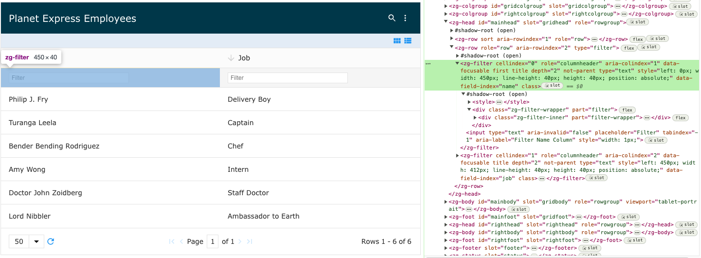
<zg-filter>
Interactive Storybook Playground
The <zg-filter> tag is the container for a single cell when the cell contains a filter. It is used as a
CSS target for styling by the developer. The <zg-filter> web component should not be accessed specifically beyond styling.

Related Web Components
Usage
The <zg-filter> element is a generated element added to <zing-grid> when the filter="inline" attribute is defined.
<zing-grid filter="inline"
  src="https://cdn.zinggrid.com/datasets/user-roles.json">
</zing-grid>
Attributes
There are no attributes available for the <zg-filter> web component.
CSS Variables
<zg-filter> can be styled with CSS variables, like so:
:root {
--zg-filter-background: red;
}
Below is a list of all the associated --zg-filter CSS variables. Check out the full list of CSS variables or our Styling Basics guide to learn more about styling the grid.
| Name | Default | Description | Demo | CSS Ref |
|---|---|---|---|---|
| --zg-filter-background | Browser's default value | Styles the background of filter | ||
| --zg-filter-background_sorted | Browser's default value | Styles the background color of filter when the column in sorted | ||
| --zg-filter-border | 0 | Styles the border of filter | ||
| --zg-filter-border-bottom | var(--zg-filter-border, 0) | Styles the bottom border of filter | ||
| --zg-filter-border-left | var(--zg-filter-border, 0) | Styles the left border of filter | ||
| --zg-filter-border-right | var(--zg-filter-border, 0) | Styles the right border of filter | ||
| --zg-filter-border-top | var(--zg-filter-border, 1px solid var(--theme-border-color)) | Styles the top border of filter | ||
| --zg-filter-color | var(--theme-color_alt) | Sets the font color of text inputted in filter | ||
| --zg-filter-height | Browser's default value | Sets the height of filter | ||
| --zg-filter-input-background | Browser's default value | Styles the background of input field in filter | ||
| --zg-filter-input-background_sorted | Browser's default value | Styles the background of input field in filter when sorted | ||
| --zg-filter-input-border | 0 | Styles the border of input field in filter | ||
| --zg-filter-input-border-bottom | var(--zg-filter-input-border) | Styles the bottom border of input field in filter | ||
| --zg-filter-input-border-bottom_sorted | var(--zg-filter-input-border) | Styles the bottom border of input field in filter when sorted | ||
| --zg-filter-input-border-left | var(--zg-filter-input-border) | Styles the left border of input field in filter | ||
| --zg-filter-input-border-left_sorted | var(--zg-filter-input-border) | Styles the left border of input field in filter when sorted | ||
| --zg-filter-input-border-radius | Browser's default value | Applies a border radius to filter input | ||
| --zg-filter-input-border-radius_sorted | Browser's default value | Applies border radius to filter input when sorted | ||
| --zg-filter-input-border-right | var(--zg-filter-input-border) | Styles the right border of input field in filter | ||
| --zg-filter-input-border-right_sorted | var(--zg-filter-input-border) | Styles the right border of input field in filter when sorted | ||
| --zg-filter-input-border-top | var(--zg-filter-input-border) | Styles the top border of input field in filter | ||
| --zg-filter-input-border-top_sorted | var(--zg-filter-input-border) | Styles the top border of input field in filter when sorted | ||
| --zg-filter-input-border_sorted | 0 | Styles the border of input field in filter when sorted | ||
| --zg-filter-input-color | Browser's default value | Styles the font color of text in input field of filter | ||
| --zg-filter-input-color_sorted | Browser's default value | Styles the font color of text in input field of filter when sorted | ||
| --zg-filter-input-font-size | Browser's default value | Sets the font size of filter input | ||
| --zg-filter-input-height | 20px | Sets the height of input field in filter. May need to set --zg-filter-height if input field is height is larger than height of filter. | ||
| --zg-filter-input-margin | 0 var(--theme-padding_x) | Sets the margin of filter input | ||
| --zg-filter-input-padding | 0 0 0 5px | Sets the padding of input field in filter. . May need to set --zg-filter-height if input field is height is larger than height of filter. | ||
| --zg-filter-padding | A cell's left and right padding | Sets the padding of the filter | ||
| --zg-filter-select-color | Browser's default value | Styles the font color of text in the select dropdown filter | ||
| --zg-filter-select-font-size | Browser's default value | Sets the font size of the select dropdown filter | ||
| --zg-filter-select-height | Browser's default value | Sets the height of the select dropdown filter | ||
| --zg-filter-select-margin | Browser's default value | Sets the margin of the select dropdown filter |
CSS Selector
<zg-filter> can be styled by common CSS selectors, like so:
zg-filter {
  background: red;
}
CSS Shadow Parts
<zg-filter> exposed elements within the shadow can be styled by CSS shadow parts, like so:
zg-filter::part(filter) {
  background-color: red;
}
Below is a list of all the associated ZGFilter shadow parts. Check out the full list of CSS shadow parts or our Styling Basics guide to learn more about styling the grid.
| Name | Description |
|---|---|
| filter | Filter container. |
| filter-wrapper | Wrapper for the filter field |
Slots
There are no slots available for the <zg-filter> web component.
[api: <zg-filter>]