Opening a Modal on Render
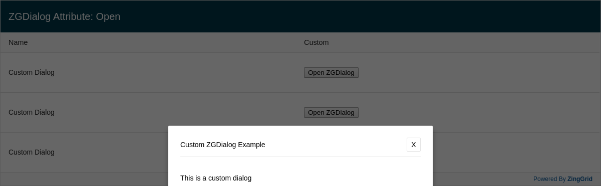
ZingGrid has a native dialog component that is fully customizable and extensible with events. This customizable dialog allows you to put content in a custom modal and abstracts functionality away from developers like centering a modal, masking the background, or clicking away to cancel.
Result
Full
HTML
CSS
JS
Edit
Download
This is a custom dialog
Add the "open" attribute to ZGDialog.
This will have the dialog opened by default.
Omitting this attribute or setting it to false will hide the dialog.
Full Code
<!DOCTYPE html>
<html>

<head>
  <meta charset="utf-8">
  <title>ZingGrid Demo</title>
  <script nonce="undefined" src="https://cdn.zinggrid.com/zinggrid.min.js"></script>
  <style>
    zing-grid {
      /* default Liverpool CSS variable colors */
      --zg-row-body-height: 80px;
    }

    .zg-body {
      background: #e6e6e6;
    }

    zing-grid[loading] {
      height: 373px;
    }
  </style>
</head>

<body class="zg-modal">
  <zing-grid caption="ZGDialog Attribute: Open">
    <zg-data data='[
      {
        "name": "Custom Dialog",
        "type": "custom"
      },
      {
        "name": "Custom Dialog",
        "type": "custom"
      },
      {
        "name": "Custom Dialog",
        "type": "custom"
      }
    ]'></zg-data>
    <zg-colgroup>
      <zg-column index="name"></zg-column>
      <zg-column index="type" hidden></zg-column>
      <zg-column index="custom" renderer="viewDialog">
        <button class="view" type="submit">Open ZGDialog</button>
      </zg-column>
    </zg-colgroup>
    <zg-dialog type="custom" label="Custom ZGDialog Example" open>
      <div>
        <p>This is a custom dialog</p>
        <p>Add the "open" attribute to ZGDialog.</p>
        <p>This will have the dialog opened by default.</p>
        <p>Omitting this attribute or setting it to false will hide the dialog.</p>
      </div>
    </zg-dialog>
  </zing-grid>
  <script>
    ZingGrid.setLicense(['26ccbfec16b8be9ee98c7d57bee6e498']); // window:load event for Javascript to run after HTML
    // because this Javascript is injected into the document head
    window.addEventListener('load', () => {
      // Javascript code to execute after DOM content

      // On row click, click the "Open ZGDialog" button
      const zgRef = document.querySelector('zing-grid');
      let button;
      zgRef.addEventListener('row:click', e => {
        button = e.detail.ZGTarget.querySelector('button');
        button.click();
      });
    });

    // Register method to attach click event listener "Open ZGDialog" button
    function viewDialog(customIndex, cellRef, $cell) {
      // $cell.record gives us us direct information related to this row
      const {
        type
      } = $cell.record;
      // $cell.dom() gives us direct access to this <zg-cell> element
      // You can query up and down from there
      const button = $cell.dom().querySelector('button');
      const targetDialog = 'type="custom"';
      let dialog, zg;
      // Add button click listener
      button.addEventListener('click', e => {
        zg = this.widget.webcomponent;
        dialog = zg.querySelector(`zg-dialog[${targetDialog}]`);
        dialog.setAttribute('type', type);
        dialog.setAttribute('open', '');
      });
    }
    ZingGrid.registerMethod(viewDialog, 'viewDialog');
  </script>
</body>

</html>
<!DOCTYPE html>
<html>
  <head>
    <meta charset="utf-8">
    <title>ZingGrid Demo</title>
    <script src="https://cdn.zinggrid.com/zinggrid.min.js"></script>
  </head>
  <body class="zg-modal">
    <zing-grid
    	caption="ZGDialog Attribute: Open"
  	>
    <zg-data data='[
      {
        "name": "Custom Dialog",
        "type": "custom"
      },
      {
        "name": "Custom Dialog",
        "type": "custom"
      },
      {
        "name": "Custom Dialog",
        "type": "custom"
      }
    ]'></zg-data>
    <zg-colgroup>
      <zg-column index="name"></zg-column>
      <zg-column index="type" hidden></zg-column>
      <zg-column index="custom" renderer="viewDialog">
        <button class="view" type="submit">Open ZGDialog</button>
      </zg-column>
    </zg-colgroup>
    <zg-dialog
      type="custom"
      label="Custom ZGDialog Example"
      open>
      <div>
        <p>This is a custom dialog</p>
        <p>Add the "open" attribute to ZGDialog.</p>
        <p>This will have the dialog opened by default.</p>
        <p>Omitting this attribute or setting it to false will hide the dialog.</p>
      </div>
    </zg-dialog>
  </zing-grid>
  </body>
</html>
zing-grid {
 /* default Liverpool CSS variable colors */
 --zg-row-body-height:80px;
}

.zg-body {background:#e6e6e6;}
// window:load event for Javascript to run after HTML
// because this Javascript is injected into the document head
window.addEventListener('load', () => {
  // Javascript code to execute after DOM content

  // On row click, click the "Open ZGDialog" button
  const zgRef = document.querySelector('zing-grid');
  let button;
  zgRef.addEventListener('row:click', e => {
    button = e.detail.ZGTarget.querySelector('button');
    button.click();
  });
});

// Register method to attach click event listener "Open ZGDialog" button
function viewDialog(customIndex, cellRef, $cell) {
  // $cell.record gives us us direct information related to this row
  const {type} = $cell.record;
  // $cell.dom() gives us direct access to this <zg-cell> element
  // You can query up and down from there
  const button = $cell.dom().querySelector('button');
  const targetDialog = 'type="custom"';
  let dialog, zg;
	// Add button click listener
  button.addEventListener('click', e => {
    zg = this.widget.webcomponent;
    dialog = zg.querySelector(`zg-dialog[${targetDialog}]`);
    dialog.setAttribute('type',type);
    dialog.setAttribute('open','');
  });
}
ZingGrid.registerMethod(viewDialog, 'viewDialog');
Interested in this demo? Modify it to your needs in ZingSoft Studio, our testing sandbox. It's free to sign up, and you can come back and edit at any time!