<zg-control-bar>
Interactive Storybook Playground
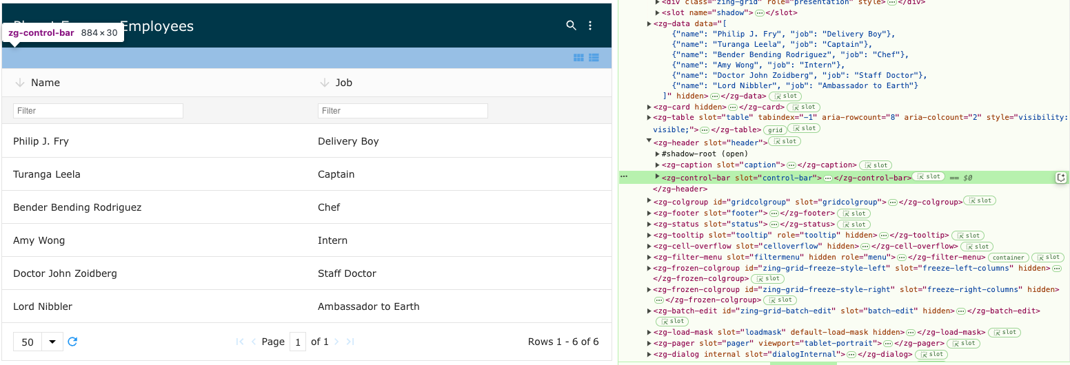
The <zg-control-bar> tag is a web component that serves as a container for the grid's interface controls. As a generated element, the user should not manually place <zg-control-bar> in their grid. However, users can style the component's internal elements using CSS.

| Component | Relationship | Type | Ancestor |
|---|---|---|---|
| ZGHeader | Parent | Generated | n/a |
| ZGLayoutControls | Child | Generated | n/a |
| ZGSeparator | Child | Generated | n/a |
Related Web Components
Usage
TO trigger the <zg-control-bar> to show, you'll need to also enable layout-controls, like so:
<zing-grid
  layout-controls
  src="https://cdn.zinggrid.com/datasets/user-roles.json">
</zing-grid>
After <zg-control-bar> is initialized, you must define some styling, like so:
zing-grid {
  --zg-control-bar-border: 10px solid #EF5350;
}
Attributes
There are no attributes available for the <zg-control-bar> web component.
CSS Variables
<zg-control-bar> can be styled with CSS variables, like so:
:root {
--zg-control-bar-padding: 2rem;
}
Below is a list of all the associated --zg-control-bar CSS variables. Check out the full list of CSS variables or our Styling Basics guide to learn more about styling the grid.
| Name | Default | Description | Demo | CSS Ref |
|---|---|---|---|---|
| --zg-control-bar-background | Browser's default value | Styles the background of control-bar | ||
| --zg-control-bar-border | 1px solid var(--theme-border-color) | Styles the border of control-bar | ||
| --zg-control-bar-border-bottom | var(--zg-control-bar-border, 1px solid var(--theme-border-color)) | Styles the bottom border of control-bar | ||
| --zg-control-bar-border-left | var(--zg-control-bar-border, 0) | Styles the left border of control-bar | ||
| --zg-control-bar-border-right | var(--zg-control-bar-border, 0) | Styles the right border of control-bar | ||
| --zg-control-bar-border-top | var(--zg-control-bar-border, 0) | Styles the top border of control-bar | ||
| --zg-control-bar-layout-content | "" | Sets the before 'content' of inner layout container | ||
| --zg-control-bar-layout-justify-content | flex-end | Sets the horizontal alignment of contents in inner layout container | ||
| --zg-control-bar-margin | 0 | Sets the margin of control-bar | ||
| --zg-control-bar-min-height | 30px | Sets the min-height of control bar | ||
| --zg-control-bar-padding | 2px var(--theme-padding_x) 2px calc(var(--theme-padding_x) - 6px) | Sets the padding of control-bar | ||
| --zg-control-bar-visibility | visible | Sets the visibility of component |
CSS Selector
<zg-control-bar> can be styled by common CSS selectors, like so:
zg-control-bar {
  border: 1px solid red;
}
CSS Shadow Parts
<zg-control-bar> exposed elements within the shadow can be styled by CSS shadow parts, like so:
zg-control-bar::part(control-bar) {
  background-color: red;
}
Below is a list of all the associated ZGControlBar shadow parts. Check out the full list of CSS shadow parts or our Styling Basics guide to learn more about styling the grid.
| Name | Description |
|---|---|
| batch-message | Container for the batch editing status message. |
| card-action | Container for the card action controls. |
| control-bar | Control-bar container. |
| layout | Container for the layout controls. |
| row-action | Container for the row action controls. |
Slots
There are no slots available for the <zg-control-bar> web component.
[api: <zg-control-bar>]