<zg-card-resize>
Interactive Storybook Playground
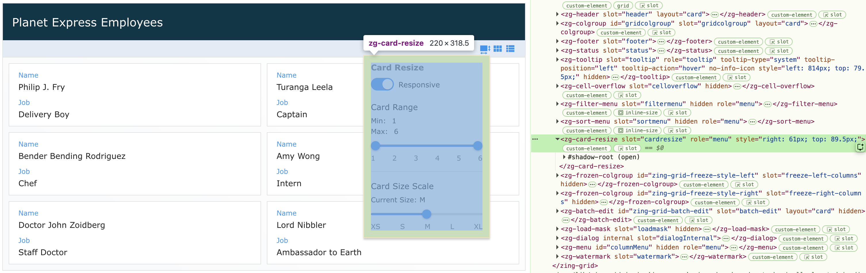
The <zg-card-resize> tag is the container for the menu that appears when clicking on the control bar's card resize button. It is used as a
CSS target for styling by the developer. The <zg-card-resize> web component should not be accessed specifically beyond styling.
| Component | Relationship | Type | Ancestor |
|---|---|---|---|
| ZingGrid | Parent | Generated | n/a |
| ZGButton | Child | Generated | n/a |
Related Web Components
Usage
The <zg-card-resize> element is a generated element added to <zing-grid> when the card-resizable attribute is defined and the grid is set to layout="card". It opens a menu, from the control bar's card resize button, that lets the user pick between a "Responsive" card size range (a Min/Max cards-per-row range with a preferred size scale) and a "Fixed" single cards-per-row size.
<zing-grid layout="card" card-resizable
  src="https://cdn.zinggrid.com/datasets/user-roles.json">
</zing-grid>
The card-resizable attribute also accepts a "fixed" value, which starts the menu in "Fixed" mode instead of the default "Responsive" mode.
<zing-grid layout="card" card-resizable="fixed"
  src="https://cdn.zinggrid.com/datasets/user-roles.json">
</zing-grid>
Attributes
There are no attributes available for the <zg-card-resize> web component.
CSS Variables
<zg-card-resize> can be styled with CSS variables, like so:
:root {
  --zg-card-resize-background: red;
}
Below is a list of all the associated --zg-card-resize CSS variables. Check out the full list of CSS variables or our Styling Basics guide to learn more about styling the grid.
| Name | Default | Description | Demo | CSS Ref |
|---|---|---|---|---|
| --zg-card-resize-background | Browser's default value | Styles background of card resize menu dropdown | ||
| --zg-card-resize-border | 1px solid var(--theme-border-color) | Styles the border of card resize menu dropdown | ||
| --zg-card-resize-box-shadow | var(--zg-menu-box-shadow, 0 3px 3px #ccc) | Applies a box shadow to card resize menu dropdown | ||
| --zg-card-resize-color | var(--theme-body-color) | Applies a baseline color to the menu | ||
| --zg-card-resize-divider-color | var(--theme-border-color, #e0e0e0) | Styles the divider line between the "Card Range" and "Card Size Scale" sections | ||
| --zg-card-resize-font-size | 0.75rem | Sets the font size of card resize menu dropdown | ||
| --zg-card-resize-header-color | var(--zg-card-resize-color, #656565) | Sets the font color of the card resize menu header | ||
| --zg-card-resize-header-font-size | 14px | Sets the font size of the card resize menu header | ||
| --zg-card-resize-header-font-weight | bold | Sets the font weight of the card resize menu header | ||
| --zg-card-resize-padding | 12px | Sets the padding of the card resize menu dropdown | ||
| --zg-card-resize-range-header-font-weight | 400 | Sets the font weight of the "Card Range" and "Card Size Scale" subheaders | ||
| --zg-card-resize-section-header-font-size | 0.875rem | Sets the font size of the "Card Range" and "Card Size Scale" subheaders | ||
| --zg-card-resize-size-ticks-font-size | 0.75rem | Sets the font size of the slider step labels (ticks) | ||
| --zg-card-resize-size-ticks-opacity | 0.7 | Sets the opacity of the slider step labels (ticks) | ||
| --zg-card-resize-slider-fill-background | #4a90e2 | Styles the background of the slider's filled portion | ||
| --zg-card-resize-slider-track-background | #ddd | Styles the background of the slider's unfilled track | ||
| --zg-card-resize-thumb-background | var(--theme-color-primary) | Styles the background of the slider thumb(s) | ||
| --zg-card-resize-toggle-background_off | #ccc | Styles the toggle switch's background when unchecked ("Fixed") | ||
| --zg-card-resize-toggle-background_on | var(--theme-color-primary) | Styles the toggle switch's background when checked ("Responsive") | ||
| --zg-card-resize-toggle-label-font-size | 0.8rem | Sets the font size of the label next to the toggle switch ("Responsive" or "Fixed") | ||
| --zg-card-resize-value-color | var(--zg-card-resize-color) | Sets the font color of the Min/Max/Card Size/Cards per row value text | ||
| --zg-card-resize-width | 220px | Sets the width of card resize menu dropdown |
CSS Shadow Parts
<zg-card-resize> exposed elements within the shadow can be styled by CSS shadow parts, like so:
zg-card-resize::part(header) {
  background-color: red;
}
Below is a list of all the associated ZGCardResize shadow parts. Check out the full list of CSS shadow parts or our Styling Basics guide to learn more about styling the grid.
| Name | Description |
|---|---|
| card-resize | The container for the menu |
| divider | The divider line between the "Card Range" and "Card Size Scale" sections |
| fixed-section | The section shown when the toggle is off ("Fixed") |
| header | The header for the menu |
| header-label | The header label for the menu |
| preferred-fill | The single-thumb preferred size slider's filled portion |
| preferred-header | The "Card Size Scale" subheader |
| preferred-input | The single-thumb preferred size slider's thumb input |
| preferred-label | The "Current Size" value label |
| preferred-slider | The single-thumb preferred size slider's wrapper |
| preferred-tick | An individual preferred size slider step label (XS, S, M, L, XL) |
| preferred-ticks | The wrapper around the preferred size slider's step labels |
| preferred-track | The single-thumb preferred size slider's unfilled track |
| range-fill | The dual-thumb range slider's filled portion, between the two thumbs |
| range-header | The "Card Range" subheader |
| range-max-input | The dual-thumb range slider's "Max" thumb input |
| range-max-label | The "Max" value label |
| range-min-input | The dual-thumb range slider's "Min" thumb input |
| range-min-label | The "Min" value label |
| range-slider | The dual-thumb Min/Max range slider's wrapper |
| range-tick | An individual range slider step label (1-6) |
| range-ticks | The wrapper around the range slider's step labels |
| range-track | The dual-thumb range slider's unfilled track |
| range-values | The wrapper around the Min/Max value labels |
| responsive-section | The section shown when the toggle is on ("Responsive") |
| size-fill | The single-thumb size slider's filled portion |
| size-input | The single-thumb size slider's thumb input |
| size-label | The "Cards per row" value label |
| size-slider | The single-thumb size slider's wrapper |
| size-tick | An individual size slider step label (1-6) |
| size-ticks | The wrapper around the size slider's step labels |
| size-track | The single-thumb size slider's unfilled track |
| toggle | The Responsive/Fixed toggle switch |
| toggle-input | The toggle switch's underlying checkbox input |
| toggle-label | The label next to the toggle switch ("Responsive" or "Fixed") |
| toggle-row | The row holding the Responsive/Fixed toggle and its label |
| toggle-track | The toggle switch's track/thumb |
Slots
There are no slots available for the <zg-card-resize> web component.
[api: <zg-card-resize>]