<zg-row-details>
Interactive Storybook Playground
The <zg-row-details> tag is a web component that is the container row expansion.
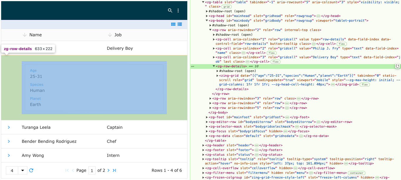
| Component | Relationship | Type | Ancestor |
|---|---|---|---|
| ZingGrid | Parent | Manual | n/a |
| ZGRow | Parent | Generated | n/a |
| ZingGrid | Child | Generated, Manual | n/a |
| * | Child | Manual | n/a |
Related Web Components
Attributes
There are no attributes available for the <zg-row-details> web component.
Top
CSS Variables
<zg-row-details> can be styled with CSS variables, like so:
:root {
  --zg-row-details-background: red;
}
Below is a list of all the associated --zg-row-details CSS variables. Check out the full list of CSS variables or our Styling Basics guide to learn more about styling the grid.
| Name | Default | Description | Demo | CSS Ref |
|---|---|---|---|---|
| --zg-row-details-background | var(--zg-head-background) | Styles the background of zg-row-details | ||
| --zg-row-details-background_opened | #f7f7f7 | Styles the background of a card's own row details section while it is open in 'card' layout-mode. Not applied to the shared `[row-details-card-mode="sidebar"]` drawer, which keeps its own `--zg-row-details-card-sidebar-background` | ||
| --zg-row-details-border | 0 | Styles the border of zg-row-details | ||
| --zg-row-details-border-bottom | 0 | Styles the bottom border of zg-row-details | ||
| --zg-row-details-border-left | 0 | Styles the left border of zg-row-details | ||
| --zg-row-details-border-right | 0 | Styles the right border of zg-row-details | ||
| --zg-row-details-border-top | 0 | Styles the top border of zg-row-details | ||
| --zg-row-details-border_opened | 2px solid #c1c1c1 | Styles the border of the row details drawer in 'sidebar' card mode. Shared with the card's own row details section (see above) | ||
| --zg-row-details-border_opened | 2px solid #c1c1c1 | Styles the border of a card and its own row details section while it is open in 'card' layout-mode. Also applied to the shared `[row-details-card-mode="sidebar"]` drawer (see below) | ||
| --zg-row-details-card-footer-background_hover | var(--zg-button-background_hover_solid) | Styles the background of the card's row details footer when it is hovered in 'card' layout-mode. Must be a solid color, as the footer sits above the details panel | ||
| --zg-row-details-card-footer-background_hover_opened | color-mix(in srgb, var(--zg-row-details-background_opened) 95%, black) | Styles the background of the card's row details footer on hover while its details are open, in both 'bottom' and 'sidebar' card-mode. In 'bottom' mode the footer sits on top of --zg-row-details-background_opened once open rather than the card's normal background, so its hover color is computed against that instead of the generic --zg-row-details-card-footer-background_hover (which assumes the plain card background and, left alone, renders identically to the open background in themes where both default to the same gray). Reused as-is in 'sidebar' mode so the toggle's hover feedback matches once its drawer is open, even though the card itself doesn't take on that background locally there | ||
| --zg-row-details-card-footer-border-top | 1px solid var(--theme-border-color) | Styles the border above the card's row details button in 'card' layout-mode | ||
| --zg-row-details-card-sidebar-background | var(--zg-row-details-background) | Styles the background of the row details drawer in card mode. Falls back to the same chain the row's own details section uses, so the drawer picks up the active [theme] | ||
| --zg-row-details-card-sidebar-box-shadow | -2px 0 8px rgba(0, 0, 0, 0.15) | Styles the shadow cast by the row details drawer over the cards in card mode | ||
| --zg-row-details-card-sidebar-box-shadow-color | rgba(0, 0, 0, 0.15) | Styles the color of the shadow cast by the row details drawer over the cards in card mode. Split out from --zg-row-details-card-sidebar-box-shadow so a [theme] can re-color the shadow without having to restate the offsets, which are flipped for [dir="rtl"] | ||
| --zg-row-details-card-sidebar-font-size | inherit | Sets the font size of the row details drawer in card mode. Falls back to the same font size used by the card's own fields (see --zg-cell-content-font-size_layout_card), so the drawer's text matches the cards it belongs to, including under [compact] | ||
| --zg-row-details-card-sidebar-footer-background_hover | var(--zg-button-background_hover_solid) | Styles the background of the row details drawer's footer when its close button is hovered in card mode. Must be a solid color, as the footer is sticky over the drawer's content | ||
| --zg-row-details-card-sidebar-footer-border-top | 1px solid var(--theme-border-color) | Styles the border above the row details drawer's close button in card mode | ||
| --zg-row-details-card-sidebar-footer-height | 41px | Sets the height of the row details drawer's footer in card mode. Matches the height of the card's own row details button cell. Includes the footer's top border | ||
| --zg-row-details-card-sidebar-padding | 16px | Sets the padding of the row details drawer in card mode | ||
| --zg-row-details-card-sidebar-page-z-index | 100 | Sets the stack order of the row details drawer when it is bounded by the page, where it overlays the page rather than the grid | ||
| --zg-row-details-card-sidebar-width | 320px | Sets the width of the row details drawer in card mode | ||
| --zg-row-details-color | inherit | Sets the font color of zg-row-details | ||
| --zg-row-details-font-family | inherit | Sets the font family of zg-row-details | ||
| --zg-row-details-font-size | inherit | Sets the font size of zg-row-details | ||
| --zg-row-details-font-style | inherit | Sets the font style of zg-row-details | ||
| --zg-row-details-font-weight | inherit | Sets the font weight of zg-row-details | ||
| --zg-row-details-height | auto | Sets the height of zg-row-details | ||
| --zg-row-details-line-height | inherit | Sets the line height of zg-row-details | ||
| --zg-row-details-min-height | 70px | Sets the min-height of zg-row-details | ||
| --zg-row-details-padding | 20px 70px | Sets the padding of zg-row-details | ||
| --zg-row-details-transition | Browser's default value | Sets the transition of zg-row-details | ||
| --zg-row-details-word-break | break-all | Sets the word break of items in zg-row-details |
Top
CSS Selector
<zg-row-details> can be styled by common CSS selectors, like so:
zg-row-details {
  font-size: 2rem;
}
Top
Slots
There are no slots available for the <zg-row-details> web component.
Top
[api: <zg-row-details>]